Bifrost
Data Visualizations
  • Themes
  • Bifrost Documentaries
  • Bifrost Insights
  • About
  • Features
  • Bridges
Mode

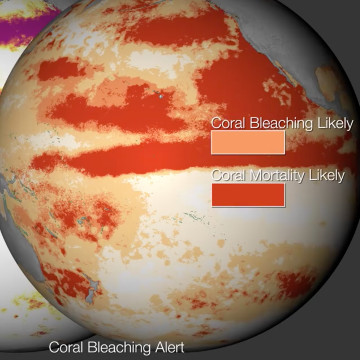
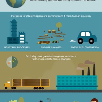
Explore the World’s Greenhouse Gas Emissions

This Interactive Chart Explains World’s Top 10 Emitters, and How They’ve Changed.

Credit: Originally published in The CAIT Climate Data Explorer, published by World Resources Institute, 2017 (CC BY-NC 4.0)

Curated by Lea Rekow for BifrostOnline
Climate datadata visualizationGHG

Related

Third-ever global coral bleaching event 2015

Global coral bleaching 2014-2015

Planetary Bands, Warming World

CAIT Climate Data toolkit

An online platform designed to empower policymakers, researchers, media and other stakeholders with the climate data, visualizations and resources.

Sea level and coastal flood risk calculator

Explore US sea level and coastal flood risks by region through data visualizations. Developed by Surging Seas Climate Central.
  • Bifrost
    Themes
  • Bifrost
    Documentaries
  • Bifrost
    Insights
  • Bifrost
    Features
  • About
    Bifrost
  • Bridges
  • Papers &
    Reports
  • Interview
    Transcripts
  • Infographics
  • Maps
  • Science
  • Data
    Visualizations
  • Climate Stories
  • Podcasts
  • Presentations
  • Curated
    Perspectives
  • Sound Art
  • Image
    Galleries
  • How it
    Works
  • Exposing Denial
  • Calculators &
    Indices
  • Climate Kids
  • Open
    Learning
  • Resource
    Atlases
  • SDG
    Trackers
  • Toolkits
  • Mobilize
  • Twitter
  • Facebook
  • Instagram
  • Youtube
  • Privacy Policy